Monday 26 September 2011

My final Year show


This is a photograph of the chosen piece I decided to present in the final year show.
I the photograph it shown my wallpaper that I designed along with the fabric on the French stools. I also had some other pieces that I designed in the white frames.

This project was based on patterns and surface design.

Tuesday 10 May 2011

PPD Positioning project


First of all I admit that I didn't spend a lot of time binding the book. Truth be I left the whole thing to the last minute and so it showed in the binding. Other than that...This was a report we had to do about our last year in uni and the work we produced (for me still producing). I decided to bind my book and place it in a 'packaging' because one of my projects is based on packaging and it also reflects on my skill in craft and creating things. The design on the case and book also reflects on a design I did for one of my projects.

Tuesday 22 March 2011

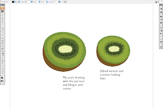
Kiwi


I know I haven't updated any work recently, as I haven't exactly completed anything yet as I'm working on 2 projects and starting a 3rd now...so this is just a little something.

A kiwi!
This is a drawing that is part of a design that I'm working on at the moment.
It was draw in in Ai Illustrator, with the pen tool. And if you're wondering I use the track pad on my mac and I have adapted to it. well.

Wednesday 1 December 2010

Defining the Times Project


This was a project where we had to produce a book/ design with information about a location of London. So from North I chose Highbury and Islington. It is a nice area out of the city, a historical landmark and nice place for a walk as its full of fields and housing.

Anyway this is what I produced. I stuck to some basic layout and following it through to keep the consistency throughout.

Wallpaper Design for Workshop


I loveeeed this project, it was fun, even though I got to admit I had a bit of a down fall towards the end. But I loved it, I enjoyed designing it, even though it was taken from a design that I did previously for no reason. I also enjoyed screen printing them too, I used, black, cream, violet/plum and silver. I tested it on different types of paper and textures...I loved the silver prints the most.
The first image is of the design drawn in Ai using the pen (anchor) tool. Then duplicated around the page to create a flow of pattern for a tile design of the wallpaper.
The second and third images are of the design converted on to a black background with the design in soft grey. This was just testing different outcomes and playing with ideas. Parts of the design was then selected and was changed in to a different colour.
The fourth image is a photograph of the screen printed wallpaper design in different colours and paper. ( I know its not an amazing photograph but you can see one is printed on purple mirror card :D so pretty.

I also did a lot of mock prints on newsprint, I used them as wrapping paper :D I guess you can use wallpaper as wrapping paper...right?? Well I think so. I wouldn't mind especially if it was textured :D

Sunday 28 November 2010

Addiction design


Using Ai, the pen anchor tool, I drew out a few things that related to addictions...Coffee, Drugs and Cookies (yes it exists as I love cookies and everything else with doe).
My chosen addiction design was cupcakes (on my other blog)
http://playdohharea.blogspot.com/2010/11/cupcakes-full-of-goodnessss.html

Bermondsey Project


This is just some of the little things produced in the project, they are icons that represent Bermondsey Market, London and Antique.
The designs are cut out of 3mm thick card and used to be embossed on to card, with the big machine.
The designs are put on the postcard folders (and a few other things).

Embossing is one of the techniques I love. The other is hand die cutting (as you will see me do hundreds of times). and since we're on the topic also love textures like flocking- fluffy texture, gloss....endless :D

Design Pattern


Some designs that I drew then used a scalpel to cut in card.
The first pattern weren't so hard and was very basic in style of William Morris. I really like his designs, they are mostly floral designs, with a twist of vintage feel. He also has a modern take of some designs that are more simple.

The second design was something I was working on for a while. It doesn't really have a direct inspiration for it but the idea is behind the flow and thin strokes of the pattern.

Musical Doll


Project..I don't remember the actual brief, but we had to design a doll that fitted into the theme of a type of film genre and then design a poster for it.
I chose musical. So this is what I came up with.
The illustration is drawn in Ai using the pen, anchor.
Printed on fabric.
Sewn together, and stuffed.
Accessorised and dressed.
Photographed and edited.
Design poster.
The poster shown actually isn't the final one, I couldn't find it so this one will have to do :)
The process of making mock-ups for the body shape took a while as well as making the actual outfit for the doll.

Bookbinding Elective workshop


The bookbinding workshop was kinda a joke to me as it was literally weeks of teaching us how to fold paper...and me being someone who does origami knows how to fold paper.

Anyways I did learn how to bookbind in another way, different from the techniques I taught myself previously.