Sunday, 28 November 2010

Addiction design


Using Ai, the pen anchor tool, I drew out a few things that related to addictions...Coffee, Drugs and Cookies (yes it exists as I love cookies and everything else with doe).
My chosen addiction design was cupcakes (on my other blog)
http://playdohharea.blogspot.com/2010/11/cupcakes-full-of-goodnessss.html

Bermondsey Project


This is just some of the little things produced in the project, they are icons that represent Bermondsey Market, London and Antique.
The designs are cut out of 3mm thick card and used to be embossed on to card, with the big machine.
The designs are put on the postcard folders (and a few other things).

Embossing is one of the techniques I love. The other is hand die cutting (as you will see me do hundreds of times). and since we're on the topic also love textures like flocking- fluffy texture, gloss....endless :D

Design Pattern


Some designs that I drew then used a scalpel to cut in card.
The first pattern weren't so hard and was very basic in style of William Morris. I really like his designs, they are mostly floral designs, with a twist of vintage feel. He also has a modern take of some designs that are more simple.

The second design was something I was working on for a while. It doesn't really have a direct inspiration for it but the idea is behind the flow and thin strokes of the pattern.

Musical Doll


Project..I don't remember the actual brief, but we had to design a doll that fitted into the theme of a type of film genre and then design a poster for it.
I chose musical. So this is what I came up with.
The illustration is drawn in Ai using the pen, anchor.
Printed on fabric.
Sewn together, and stuffed.
Accessorised and dressed.
Photographed and edited.
Design poster.
The poster shown actually isn't the final one, I couldn't find it so this one will have to do :)
The process of making mock-ups for the body shape took a while as well as making the actual outfit for the doll.

Bookbinding Elective workshop


The bookbinding workshop was kinda a joke to me as it was literally weeks of teaching us how to fold paper...and me being someone who does origami knows how to fold paper.

Anyways I did learn how to bookbind in another way, different from the techniques I taught myself previously.

Letterpress workshop


Words of expressing opposites. Hope and Fear

Poster Design by
Birsen Husseyin
Karlai Cheung
Louise Organ
Martin Colairo

Thursday, 25 November 2010

Moving on to Second Year on uni


Domestic Implements.

I chose the corkscrew...I don't know why, but I did.
This is the word 'cork' cut out of this sheet of cork I had at home..I don't know why but I did. But I believe you can get it at Cass Art too. Anyway I also cut the word 'screw' out of foil stuck to card.

X-mas cards. 2009


I designed and made this 3D X-mas Tree card. I only made a few for my Parents and a few Friends :D I then stuck Gems on them and put a confetti star on top.

Wednesday, 24 November 2010

Domestic Pets?


This project was based on domestic pets, the requirements was to produce a poster for a campaign that reflected on the idea that 'fake' or robots- technology controlled animals are replacing real animals. My chosen domestic pet was a goldfish, as you you can see. I made my robot with this technique of folding paper into triagles and building it up to a shape.
I also used this technique to make a swan I put this on my other blog: http://playdohharea.blogspot.com/2010/11/matalic-swan.html
Anyway, first created a pattern based on two colours that are typical goldfish type, a goldish yellow and orange. I chose a wave pattern ( well it didn't really matter as it wasn't seen much) to represent the scales being in layers and the way light reflects on surface of the goldfish. The technique of the layering triangles also reflect of the scales and shape.

The next step was making the 'robot' it took soo much time to make it, I literally made the triangle pieces whilst watching T.V and on the tube when I was going to and from Uni...so I would say took me a day and a half considering I sit in front of the T.V a lot and a single journey take about 45-60 minutes.

The final few steps after making it was to photograph it, Photoshop it. And finally put it in a campaign poster context.
What do you think? I'm not so sure on type. I've never been so good at picking type. I need someone to help me :D

Wold Culture Festival of Music and Dance


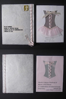
This was a project "Wold Culture Festival of Music and Dance" we had to once again choose a dance and produce an invitation design that could not use any form of technology to produce. I chose to continue on looking into Ballet.
One of the images show bits of my sketchbook. I think I enjoyed this project as it was a hands-on project where I could just experiment with material and make little things.
The other image shows the unopened envelope with the invitation still inside and another invitation card. We had to produce two of the design to show that it could be mass produced to be send out to a group of people.
Sticking to the theme I stuck to the basic colours, and used ribbon. I also used some material that reflected on the tutu's ballet's wear. I also used thick tracing paper and this soft textures paper to reflect of the type of gentle graceful dance. I then used Letraset, for the type. I also had the home stamping kit where I could build up words with individual letters...this took time but one done it was stamp, stamp, stamp! :D
I enjoyed making bows out of ribbon...I also like doing that on presents..can't wait till x-mas wrapping. :) But back to the point it took me awhile to figure out how to bind the envelope, for it to be sealed. The way it works is that when you "Pull to Open" the string unties itself (becoming a long piece of ribbon that is reusable) unbinding the opening. I think the best part is the opening, however once it's opened it takes time to weave the ribbon through again.

I would like to thank my mummy who helped me with figuring out a way to use the ribbon on the envelope. I mean I was harassing her all day when she only came to London to visit me and my sister's :) Mummy's are the best, and lets not forget about the dinner she makes every time she visits...I literally grab on to my belly after ^.^ no it's not a great sight :D

Dance - Ballet


We had to illustrate a type of dance with out text, I chose Ballet. I represented this with ribbon in reflection of ballet shoes. I used the ribbon to show the movements of ballet, soft gentle but some fast steps.

This is only the frames that was used, I actually don't have a copy of the illustrated version.

Green = Recyclng


This was a similar project as before except we got a colour of random choice and had to produce a book. I got the colour Green and decided to base it on recycling and this was the outcome.

I think I quite like bookbinding I mean I only know a few techniques.

December 1977. The Dead


This was produced for a project where we picked a date out of a box. We were then asked to produce something, whatever we wanted to represent the date. After a bit of research I chose to represent the date by producing a book as a reminder of those who have passed away during December 1977.
Each page represent a day of the month. It then follows with the Name and Sex of the person(s) that passed away that day. The day(s) in which no one has dies has been left with just the date and no information underneath it.
The size of the book is small, that fits into a hand. Something that is considered as comforting at the same time a something to protect and 'look-after'. The colour black represent the death and darkness of loss. and one again a comforting standard colour. Each page has a boarder in reflection of a headstone idea, with a standard font.

First Lines project


This was a 9 frame comic strip where we were only to use the first line of a story and contine it to tell a story. There was also a restriction to not use type or words. This was my attempt. This is a photograph (not a great one) of my hand cut stencil technique that I am pretty well at doing now. I used black and white card to illustrate the story.

My short comic page


My attemp of writting a short comic page sort of thing....now lets move on...

My short comic page


My attempt of writting a short comic page sort of thing....now lets move on...

3rd's the one with the hairy chest


This was my first experience of Letterpress. I got to admit Letterpress is some what stressful with the spacing and everything. But also a great way to get hands on printing experience with the old technology.

The small text reads:
Letterpress Induction Project
GMD Year 1 2008
Designed typed and printed by
Sammy Aylott
Karlai Cheung
Christian Granadoe
Narae Lee

Monday, 22 November 2010

Panda


Illustrator drawing when I learned how to use the pen tool 'properly' (or should I say My way, as it's self taught) :D

Anime Me


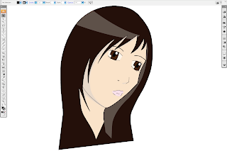
This was drawn in Ai Illustrator. This was when just first learnt how to use the pen tool. :D

Camouflage Part 2


This is continued from the camouflage pattern prints. Looking into subliminal messaging.
This hurt my eyes when I was drawing this in Ai. I had to take regular breaks :D I really like the skull, however it's not a piece I'd have put up in my house because...well it really hurts my eyes >.<
And I have got to say that it does look better printed than on screen.

And one last thing I found this and was like...Hey I did this when I was doing my foundation for my final show!! But with different concepts of course...
http://helloyoucreatives.com/post/1248124307/arrrh-my-eyes

Camouflage


Leopard Print, Pink and Black.
Pieces of coloured thread stuck on paper.
Dots, Purple and Yellow.

Moving to


I don't remember what this project was about but its a manual to my house sort of thing.

Dessert Magazine


This is when I first learnt how to use InDesign, I still learning and slowly getting used to it.
The photograph is showing the cover and three spreads.

Everyone I ever Met


This is the final piece I book bind together. The pages inside consists of people I meet during my journey home. The people are holding a Polaroid frame at the size almost A1. with writing at the bottom saying where they met me.

Moving on to my Foundation work...This was CSM


Mapping Project

I created a book of instructions and rules that a group of people has to follow.
The first step is peeling back the flap it gives you clues to a destination. as seen in 2.
If the user can not figure out the clue of the destination they tear again the edges to open up the answer to the destination.
After a series of destinations around London the final clue and destination is revealed.

Japanese inspired box


This was a Japanese influence, I think my project was based on the Japanese theme...origami, paper folding, pattern...
I designed and made the box from scratch along with the paper I used to wrap the box (using book binding technique to cover it). I really enjoyed making and the outcoem of the box :D Even though I think there is always room for improvement with everything that I produce.

Oh the white thing inside the box is my sketchbook ^.^

Iconic Poster Design


This was originally done by hand painting the details. Then scanned the A3 poster on computer and edited the colour and text to play around.

I still like the image design, but not he text..erghh seriously what was I thinking? hahaha But bearing in mind that this was done during A-level times.

Design Icon of the 20th Century - Barbie


This is the cover page of my Sketchbook to introduce my Iconic Object. It took me sometime to sew the stripy swim suit. I think I did a pretty good job don't you think? :D

Roy Lichtenstein Influence


During college times I really liked the artist Roy Lichtenstein, The idea of the benday dots representing the cheap printing process.
I did a replica painting of Crying Girl 1964. Using the style of Roy Lichenstein I created something else that represented Barbie. I used acrylic paint and a fine paintbrush to do every dot, as you can see I got tired and some lines are not straight.

Frans Masereel Hand cut frame


This is a Frans Masereel's image that I chose to hand cut with a scalpel through a few layers of paper to create a frame. I then covered both sides with acetate.

College Calendar


This was a calender created for the Sixth Form College, City and Islington in 2005 for the fall of 2006/2007.
As part of the group graphic Candi, and working with other students, the calendar was produced and funded by Aim Higher.

My name is embossed on it with other designers :D First column, Last name.